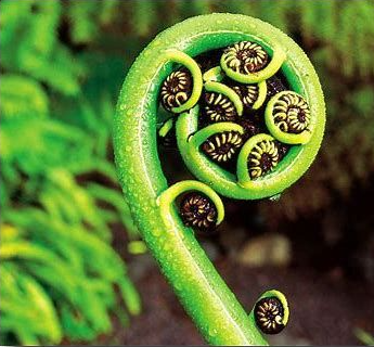

We are a New Zealand based company. Our company logo is based on the unfurling fern frond of the native New Zealand silver fern, the circular shape of the koru conveys the idea of perpetual movement. Its inner coil, the corm, with its rolled inner leaflets, suggests a return to the point of origin. In the larger scheme, this is a metaphor for the way in which life both changes and stays the same. Some have determined that the koru represents harmony. Between the chaos of change and calm of the every day, there is a point of equilibrium, a state of harmony in life. In its balanced shape, the koru represents this. The koru is also said to represent new life.
“Te rangimarie ite rangi” - is Maori for “Peace in heaven“
and was the closest translation we could get to “safety in the skies”